
Tuesday, December 3, 2013


Tuesday, November 19, 2013
Working on the website pages and animations was good to judge what content and how you access it within a defined space. I knew going in that I had to create an access point for all of the material that I have created and will create. I tried to keep a minimalistic look while still allowing the visitor to access the media with ease.
I had a problem at one point where I tried apply an adjustment to one separate layer and it applied it to all layers. I could not find a way to correct that. It was as if the layers were all linked together. I even went all of the way back in the history. ???
I have enjoyed this class. I have learned an immense amount of the tools necessary to navigate Photoshop with some amount of proficiency. Thanks Toole for the FUN!!!

Tuesday, November 12, 2013
 |
| Bottom Bird Scroll Over |

 |
| 2nd Scroll Over |
Tuesday, November 5, 2013
Biz Card
This idea came from one of the things that Ms. T discussed when the assignment was passed out. She said that we were to make a biz card that represented who we are and what we can do as graphic designers. It needed to be creative in order to catch the eye and to give a feeling of professionalism and creativity.
I am becoming quite fond of the inversion application within Photoshop. You can create something purely graphic. Something that really stands out. I included the LinkedIn button because I feel that it is a very useful social media site that can be used for business.

I am becoming quite fond of the inversion application within Photoshop. You can create something purely graphic. Something that really stands out. I included the LinkedIn button because I feel that it is a very useful social media site that can be used for business.
Photo Editing
This Flower has gone through a lot of changes. I have applied about ten of the quick tools to get the crazy color that I ended up with. I did not expect that when I applied the final inversion to all of the layers. I used the quick selection tool to select all of the flower. Then I selected the inverse of the whole flower to apply the black and white. This is one of my favorite things about Photoshop. You can take a picture and literally make it into something else that fits what you need it for. After time you learn what things do when you apply them to an image as well. This is what makes you comfortable and efficient with the program.


Tuesday, October 29, 2013
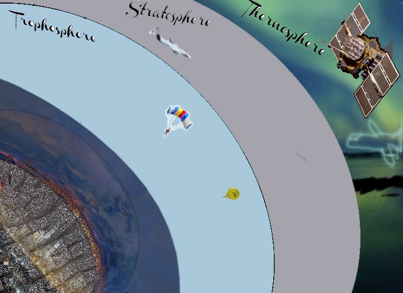
This week we were to make an informative presentation based on what we have learned from the tools that we have in Photoshop. All of the layers are seperated into other folders to keep them organized and neat. I used lots of freehand pen tools and the magic wand to fill layers. This represents what happens at the different parts of the atmosphere. What activities that take place and what is contained within the other parts of the Thermosphere.

Tuesday, October 22, 2013


The production of this invitation for SHOW Management began through PRIDE at the university. I have been able to have free will on the project but this design could only come from the media that was designed for this particular project. I could only use certain media. SOOOOO I took all of the items that I had and I cleaned them up. Changed a few things and generally mad the items sharper that were presented to me. I made 2 logos for the company so that is the white over black. It was for options.
The RSVP was of an image that I took and played with the opacity and fill layers in order to make a real cocktail party into a shadow. The confetti on the floor was harder to do than the people. It took more time to make where it wasn't too full than to just place it in and it not leave sufficient white space. I took the last picture from the stock photo the company provided me with and I colored it and placed a spread out lens flare above the name to make it stand out.
These were fun but a bit time consuming.
Tuesday, October 15, 2013

Tuesday, October 8, 2013
Playin Cards

Back of Cards - I have been exploring some of the options of color addition, removal, and inversion. Switching in and out of the layer order to get that exact look that I was looking for. The Back is about 7 different textured pictures that have been changes somehow in order to fit with the look and theme. I also took a picture and duplicated it and arranged it to 22.5 degrees to make a background pattern. The stamp tools were fun tool
Front of Card - The Queen Rania of Jordan. I thought that this is one of the few Queens that are left in the world that doesn't have the last name Middleton. I tried for the best grainy pattern that I thought was cool. The crown is a separate piece that is adjustable (see photo lol). The book under her hand is a picture of Noor that has been pancaked!!! The hardest part was getting all of the separate pieces to fit within the same feel of the whole part.
Tuesday, October 1, 2013
Working within Illustrator I used several 3-D tactics to produce the Leo Vision Logo. I created 3d extrusions that were colorized and made to look like a camera lens. I spent most of the time creating the many rings of the lens. It is abstract but it carries the resemblance of the original idea that I had for my creation. I used a grain and coloring to create the depth. We used vector images instead of the rasterized versions that are very pixelated and unclear when magnified.


Tuesday, September 24, 2013
iphone Mag

I made the textured "shattered money" background by taking another picture of an iPhone and then creating a colored overlaid 3-d image from it. It was then enlarged and placed in the fitting room of the magazine cover workspace. It represents...
Tuesday, September 17, 2013
This is an idea that I had of a meditational PS trick shot that I thought was cool. I have just learned to use Photoshop but some of it''s properties are similar to that of Aperture. I even think that you can do more with PS. I like the openness of the program and I like the lasso tool in particular to cut out the figures and place them within another foto. The use of masking helped to further sharpen your look of a section that was placed into the other foto. Fun!


Color Palette
I have chosen a few colors from the paints that I have used in my home to repaint it last month.
The light orange is the color of the undertones from the cabinets that were refinished in the kitchen.
The lighter color of green is from the accents that naturally came out when the fence was painted a pickled finish.
The red came from the two pillows and the throw rug that is now in the living room. Against a tanned leather couch, it gives a rich brown even more life and character. It will never look the same without the red...
The lighter blue is the color of the bottom half of the bathroom that is done to the style of light houses and pelicans. It is joyful and it matches the furnishings that we bought for the room, perfectly.
The darker blue is from a painting that hangs in the same bathroom. The first light house is set upon a building of that color. I gives it a royal base that appears strong and resistant to the sun and surf.
The darker green is from a shade of paint that was used to sponge paint over a maroon and gold textured canopy that is above the master bed. I gives a great depth to the texturing and the general area.
The yellow is the base color for my little girls room. It brings out the joy that is created in her room. It is my favorite color for that specific reason and purpose.

Tuesday, September 10, 2013

I used the colors because they are recognized as Microsoft's colors. I used the pattern for the bout because it was industrial and futuristic. I used the skew tool quite a bit to get the shape of the sails and the boat.
More to come about the NEW Microsoft App that can do it all for you
Subscribe to:
Posts (Atom)