Tuesday, November 19, 2013

Working on the website pages and animations was good to judge what content and how you access it within a defined space. I knew going in that I had to create an access point for all of the material that I have created and will create. I tried to keep a minimalistic look while still allowing the visitor to access the media with ease.

I had a problem at one point where I tried apply an adjustment to one separate layer and it applied it to all layers. I could not find a way to correct that. It was as if the layers were all linked together. I even went all of the way back in the history. ???

I have enjoyed this class. I have learned an immense amount of the tools necessary to navigate Photoshop with some amount of proficiency.  Thanks Toole for the FUN!!!

Tuesday, November 12, 2013


Bottom Bird Scroll Over
I had the idea for this website frontpage from another computer graphics website. I handmade the birds from an image and then I zoomed way in and deleted the parts the made them appear the way I wanted.  The center picture was a picture of a broken barn window that I made circular and then worked on the color and mixture. The Lion in the middle was the royal lion from RBC Bank. I made it into a glass image by the adjustments. It somehow changed the opacity from the adjustments in the other layers. I can't seem to adjust it back and so the purples are a little different. We made the different layer comps so that the layers do not actually change just their appearance for roll over automation. It was fun and I see how it could work in order to demonstrate this to a Web Designer for the making of your website. 


2nd Scroll Over

Tuesday, November 5, 2013

Biz Card

This idea came from one of the things that Ms. T discussed when the assignment was passed out. She said that we were to make a biz card that represented who we are and what we can do as graphic designers. It needed to be creative in order to catch the eye and to give a feeling of professionalism and creativity.

I am becoming quite fond of the inversion application within Photoshop. You can create something purely graphic. Something that really stands out.  I included the LinkedIn button because I feel that it is a very useful social media site that can be used for business.

Photo Editing

This Flower has gone through a lot of changes. I have applied about ten of the quick tools to get the crazy color that I ended up with. I did not expect that when I applied the final inversion to all of the layers. I used the quick selection tool to select all of the flower. Then I selected the inverse of the whole flower to apply the black and white. This is one of my favorite things about Photoshop. You can take a picture and literally make it into something else that fits what you need it for.  After time you learn what things do when you apply them to an image as well. This is what makes you comfortable and efficient with the program.

Tuesday, October 29, 2013

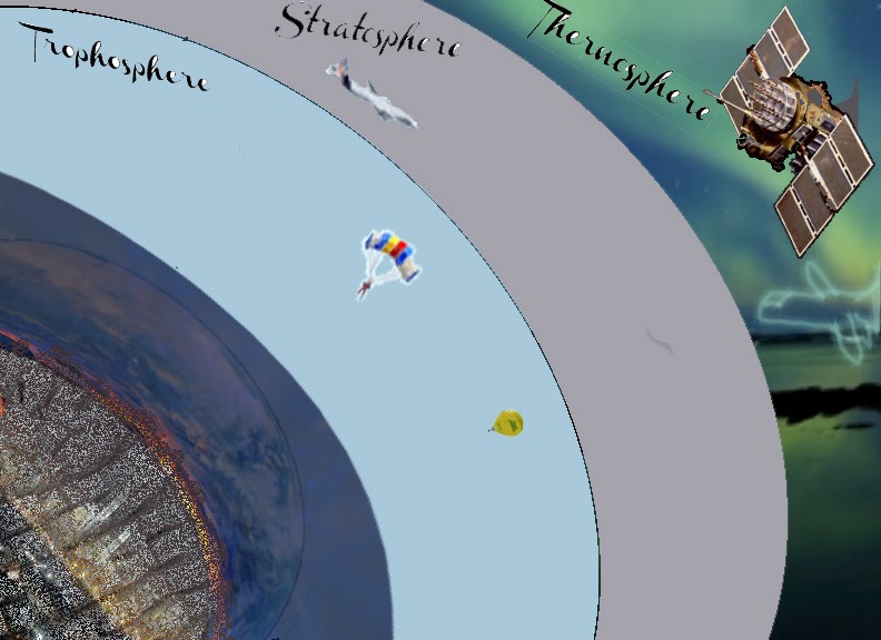
This week we were to make an informative presentation based on what we have learned from the tools that we have in Photoshop. All of the layers are seperated into other folders to keep them organized and neat. I used lots of freehand pen tools and the magic wand to fill layers. This represents what happens at the different parts of the atmosphere. What activities that take place and what is contained within the other parts of the Thermosphere.


Tuesday, October 22, 2013


The production of this invitation for SHOW Management began through PRIDE at the university. I have been able to have free will on the project but this design could only come from the media that was designed for this particular project. I could only use certain media. SOOOOO I took all of the items that I had and I cleaned them up. Changed a few things and generally mad the items sharper that were presented to me. I made 2 logos for the company so that is the white over black. It was for options. 

The RSVP was of an image that I took and played with the opacity and fill layers in order to make a real cocktail party into a shadow. The confetti on the floor was harder to do than the people. It took more time to make where it wasn't too full than to just place it in and it not leave sufficient white space. I took the last picture from the stock photo the company provided me with and I colored it and placed a spread out lens flare above the name to make it stand out. 

These were fun but a bit time consuming. 


Tuesday, October 15, 2013

I used some of the blur tools on different layers to create the motion effect that was required. I cut out the bat then positioned it to make the motion. I used several light changes and opacity levels for the background. I feel that the depth created by where the focus (Hank Aaron) was supposed to be. I wanted to make the photo feel like He was the true meaning for capturing one of his most defining moments. Hitting a homerun in the world series. The pitcher, the other players and the umpire did not really matter ... it was his moment.