Tuesday, October 29, 2013
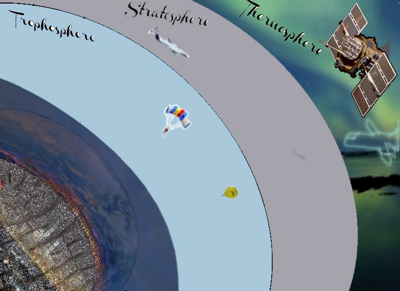
This week we were to make an informative presentation based on what we have learned from the tools that we have in Photoshop. All of the layers are seperated into other folders to keep them organized and neat. I used lots of freehand pen tools and the magic wand to fill layers. This represents what happens at the different parts of the atmosphere. What activities that take place and what is contained within the other parts of the Thermosphere.

Tuesday, October 22, 2013


The production of this invitation for SHOW Management began through PRIDE at the university. I have been able to have free will on the project but this design could only come from the media that was designed for this particular project. I could only use certain media. SOOOOO I took all of the items that I had and I cleaned them up. Changed a few things and generally mad the items sharper that were presented to me. I made 2 logos for the company so that is the white over black. It was for options.
The RSVP was of an image that I took and played with the opacity and fill layers in order to make a real cocktail party into a shadow. The confetti on the floor was harder to do than the people. It took more time to make where it wasn't too full than to just place it in and it not leave sufficient white space. I took the last picture from the stock photo the company provided me with and I colored it and placed a spread out lens flare above the name to make it stand out.
These were fun but a bit time consuming.
Tuesday, October 15, 2013

Tuesday, October 8, 2013
Playin Cards

Back of Cards - I have been exploring some of the options of color addition, removal, and inversion. Switching in and out of the layer order to get that exact look that I was looking for. The Back is about 7 different textured pictures that have been changes somehow in order to fit with the look and theme. I also took a picture and duplicated it and arranged it to 22.5 degrees to make a background pattern. The stamp tools were fun tool
Front of Card - The Queen Rania of Jordan. I thought that this is one of the few Queens that are left in the world that doesn't have the last name Middleton. I tried for the best grainy pattern that I thought was cool. The crown is a separate piece that is adjustable (see photo lol). The book under her hand is a picture of Noor that has been pancaked!!! The hardest part was getting all of the separate pieces to fit within the same feel of the whole part.
Tuesday, October 1, 2013
Working within Illustrator I used several 3-D tactics to produce the Leo Vision Logo. I created 3d extrusions that were colorized and made to look like a camera lens. I spent most of the time creating the many rings of the lens. It is abstract but it carries the resemblance of the original idea that I had for my creation. I used a grain and coloring to create the depth. We used vector images instead of the rasterized versions that are very pixelated and unclear when magnified.


Subscribe to:
Comments (Atom)